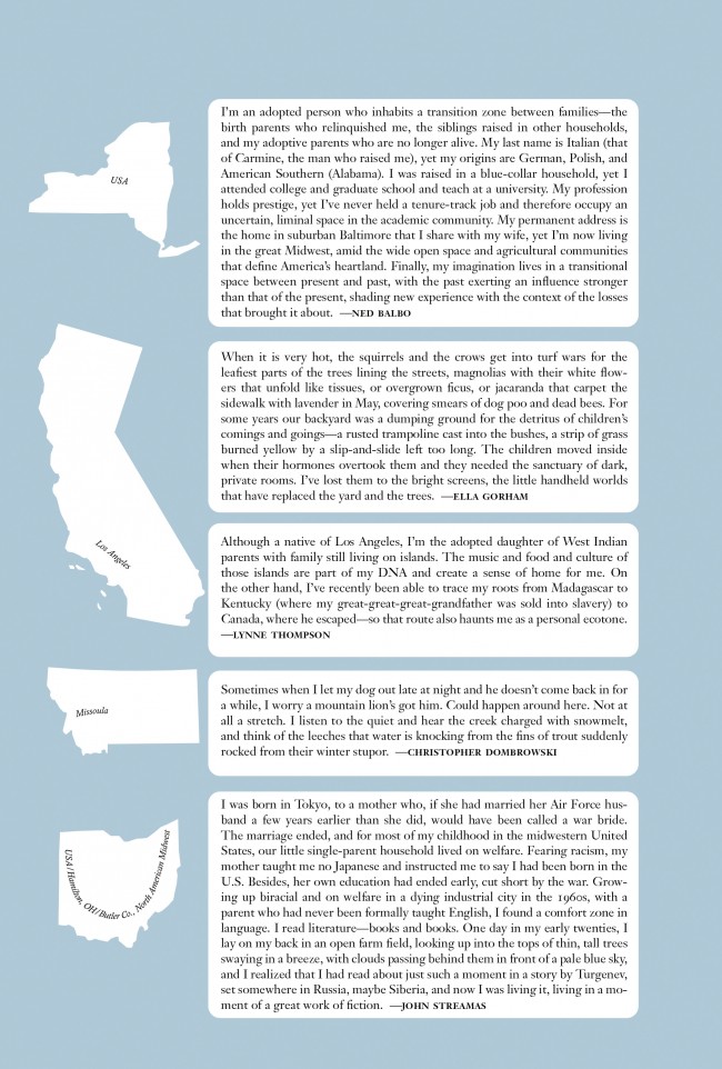
For the tenth anniversary issue of Ecotone Magazine I was asked to create a visualization that explored the results of surveys that had been sent out to subscribers in anticipation of the next issue.
The survey prompted to answer four things: where do you call home, list your favorite article (and issue), and describe what where you imagine your favorite article was set.
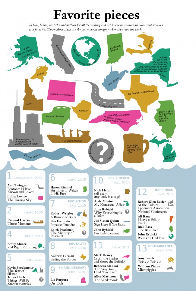
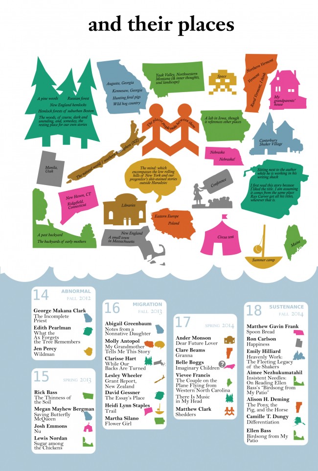
As one might expect of a literary magazine, the responses were verbose and creative! I eventually settled on two visualizations of the survey data. I would make a map that tried to show, as much as possible, where the response came from. A second visualization would show favorite issues and articles, and tie them to a thought cloud of the places that survey responses imagined the article was set.
The editors also wanted to highlight some of their favorite survey responses. The final print version started with these highlighted respondents:
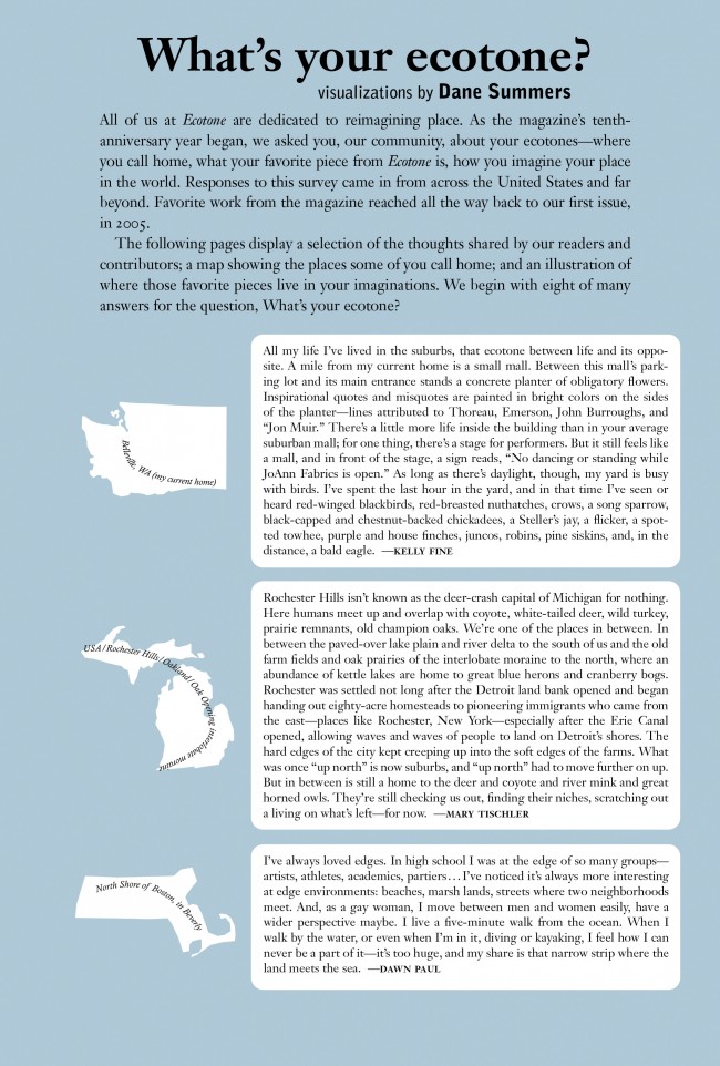
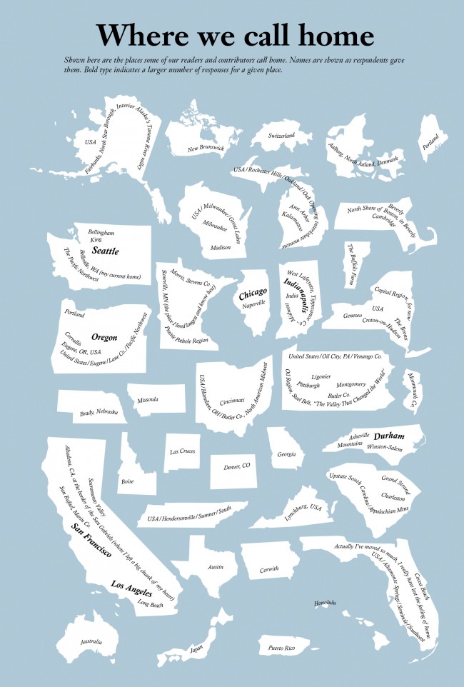
Page three showed the map of the places survey respondents ‘called home’.
The remaining pages showed the last visualization. The top part of the visualization included the text from the survey response over an icon depicting the imagined place. The bottom part showed the articles themselves, set within the context of the issue the article came from.